Friday, July 31, 2009
Thursday, July 30, 2009
Just came across this wackiness by Foreign Office Architects, their Villa in Pedralbes, Barcelona, Spain, completed last year. The architects describe the house as a response to the steeply sloping site, its three floors merging with the landscape at each level.
[Villa in Pedralbes, Barcelona, Spain by Foreign Office Architects | image source]
Basically the house opens itself at the front and the back of the house, allowing for cross-ventilation, light and views in those two directions. The house closes itself off to its neighbors on either side.
[Villa in Pedralbes, Barcelona, Spain by Foreign Office Architects | image source]
Of course, addressing the topography, light and vent, views, and the neighboring buildings could have occurred in many different ways. The architects went with what they're known for: continuous surfaces that warp, wrap and blend with their surroundings. The influence of the Yokohama Ferry Terminal is evident, especially in the shape of the glazed openings and the handrails, a necessary feature that nevertheless appears to be an afterthought.
[Villa in Pedralbes, Barcelona, Spain by Foreign Office Architects | image source]
Like other FOA designs, this one is striking, but it reminds me of what I don't like about their designs, namely a certain clumsiness in the forms, a lack of elegance when they venture into topographical designs. Projects like the Spanish Pavilion at Expo 2005 or the folding facades of Carabanchel Housing, which exploit the potential of the orthogonal, are better results than this house or even parts of the Ferry Terminal. Maybe FOA thrives on restrictions, so when they're given free reign their designs scream for somebody or something to keep them in line.
 Do you have a favorite house in your neighborhood? Maybe it's one you've never even been in but you always look at it longingly? This townhouse up the street has always intrigued me. I think I can honestly say it's my favorite house in Dupont Circle in this case. A bit quirky, the style doesn't really fit in with the stereotypical red brick Victorian rowhouses nor with the grand beaux arts mansions in this area. Instead -it combines the best features of both!
 The plaque near the door says that it was built in the early 20th century for a local architect -HIS dream house: No wonder I have such a connection with it! Grand but not large with a beautiful garden to welcome you, I can only imagine how beautiful the insides is! Sometimes the mystery is the best part -I can conjur up my dream interiors to match the exterior!
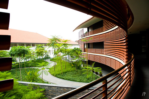
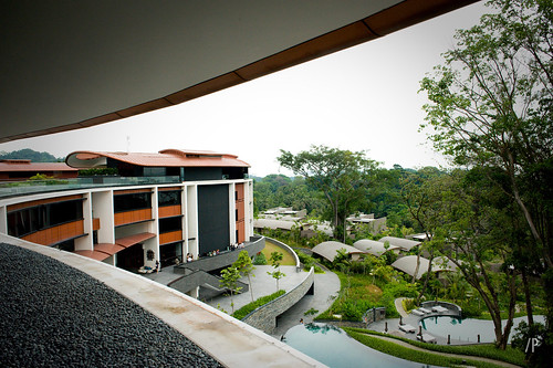
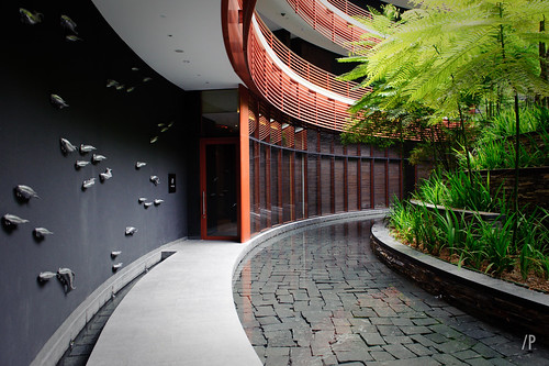
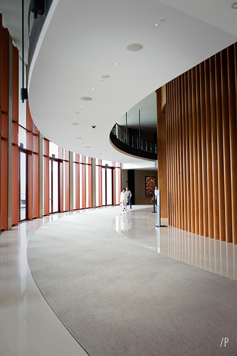
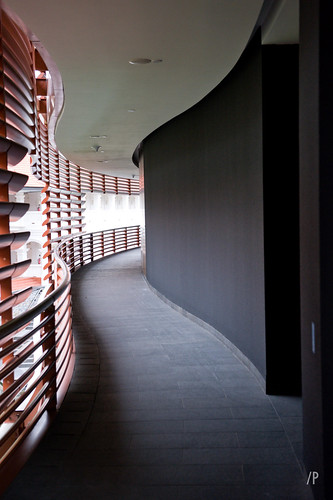
Here are some photos of Capella Singapore in Singapore, Singapore (2003-2009) by Foster + Partners, photographed by parameters75.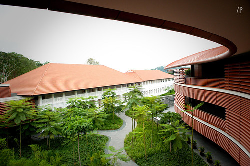
To contribute your Flickr images for consideration, just:
:: Join and add photos to the archidose pool, and/or
:: Tag your photos archidose
Tuesday, July 28, 2009
 Tintinhull House is a beautiful house mostly known for its arts & crafts garden. Located in Somerset, England, the gardens surround a 17th century house which is built of the local stone, Ham stone. The house and property belonged to the Napper family until 1814 when it passed through the hands of numerous families before it was bought by Phyllis Reiss in 1933.
Phyllis designed the gardens in the Hidecote style and developed them before gifting them to the National Trust in 1955. She continued to live in the house, caring for the gardens, till her death in 1961. Since then the house has gone through a number of lucky residents. I suppose living in the middle of a tourist attraction wouldn't be so bad if it were so beautiful!
Plan your visit at the National Trust
More information from Wikipedia
Photo courtesy of an Australian friend who visited last month. Thanks! Look forward to some more of his beautiful photographs of English country houses!
Monday, July 27, 2009
If it works in Quito:
[Mariscal Sucre International Airport in Quito, Ecuador | image source]
Then why not in Manhattan?:
[Proposed Manhattan Airport by The Manhattan Airport Foundation | image source]
Oh wait, Mariscal doesn't work, which is why a new airport is being built 20km (12.4 miles) east of its current location, set to open in 2010. Nevertheless The Manhattan Airport Foundation is proposing the transformation of Central Park into an airport, a "viable and centrally-located international air transportation hub in New York City for the benefit of all New Yorkers."
Obviously this isn't a serious proposal, but the web page is presented in such a way -- particularly its assured and persuasive language -- that the project seems to mock proposals of this type, large (infrastructure) projects that purport to help people but have detrimental effects that offset the apparent benefits. Here the downsides are particularly obvious, with noise, fumes, heat, aircraft clearances, and the appearance of an airport in the middle of Manhattan being at the top of the list.
The answer to the FAQ, "I own an apartment alongside Central Park. What will Manhattan Airport do to my property value?" reveals the dry satire in the proposal, many notches down from The Onion. Statements that "these types of transformative public works projects have created an influx of interest and new investment in the neighborhoods in which they have been built" and that the area would "experience the economic 'trickle-down' effect these types of large scale redevelopment projects have precipitated time and time again" are clearly false, though they sound awfully persuasive here.
I'm not sure who's behind this fake proposal, or if it's worth the time and effort in creating the text and images, but I'm almost certain the combination of skilled writing, crude 3d images and professional-looking web page will fool many people in thinking the proposal is genuine.
(via Curbed)
 This past weekend I visited the Phillips Collection, a private museum here in Dupont Circle, DC which has an enviable collection of modern masters. Founded in 1921 by Duncan Phillips (a fellow Pittsburgher), the museum remains small but incredibly important. Works by Renoir (seen above), Paul Cezanne (also seen above) and Monet sit alongside very contemporary art. The museum was the first modern art museum in the United States which explains the incredible collection.
 I was drawn to the museum for the 'Paint made Flesh' exhibit which I highly recommend! Seen above is the new addition which houses the entrance. It quietly fits onto a small street, respecting the stately townhouses and embassies that are neighbors, just 3 blocks from the metro.
  Here you can see the original structure, a 1897 Georgian revival townhouse which was Duncan's home. After the deaths of his father & brother, Duncan and his mother dedicated the collection to their memory. In 1930 the collection was becoming so large that they moved out of the house and devoted it entirely to the museum.
 Above is a work by Paul Gaugin -I just love the colors and besides, the meal just looks delicious. At the top of the post is of course 'Luncheon of the boating party' by Pierre-Auguste Renoir(1880-1881) which Duncan purchased in 1923 -the museum's most well known painting to this day but surely not its finest.
 A painting by Chagall (my favorite artist).
The museum is known for its unusual approach to displaying the works. The collection is not shown in order by date or artist, but by similarities seen in the works themselves. This makes for a really enjoyable visit (as does the intimate scale of the space). I hope on your next visit to DC you visit the Phillips!
Sunday, July 26, 2009
The Chicago Tribune reports that Prairie Avenue Bookshop, "the best architectural bookshop in the world," may be closing its doors on the first of September if owners Wilbert and Marilyn Hasbrouck do not find a buyer. My friend Brandon tipped me off to this a few weeks ago, but I didn't want to believe it then, and it's hard to believe now. Even with Amazon.com's discounts I thought of Prairie Avenue as a mainstay, due to its deep catalog, used books and rare titles, items harder to come by and appreciate online. The Trib points out the 10.25% sales tax, "people [who] would come to the bookshop with their notepad, make notes of what they wanted and then go buy it somewhere else," and $650,000 in two lines of credit. Depressing, to say the least.
[Outside Praire Avenue Bookshop at 418 S. Wabash | image source]
So if a new owner is found, one who is able to keep Prairie Avenue on its feet, how would that happen? By diversifying the selection, in effect moving it away from truly being a bookshop? From increasing its web presence, Wilbert's recommendation? Who knows, but this news does not bode well for other specialty bookstores, architecture or not. The writing on the wall is clear that books are a dying tool, pushed out by new technologies and a consumer base swept away by them. The death of bookstores is just one step in that unfortunate but eventual process.
My weekly page update:
Southbrook Vineyards in Niagara-on-the-Lake, Ontario, Canada by Diamond+Schmitt Architects.
This week's book review is The Language of Things: Understanding the World of Desirable Objects by Deyan Sudjic.
Some unrelated links for your enjoyment:
Sincerely Sustainable
"Finding true sustainability in the marketplace." (added to sidebar under blogs::sustainability)
SustainableCoin
"The official blog of the Local AEC Network, a professional networking group focused on the fields of Architecture, Engineering & Construction." (added to sidebar under blogs::sustainability)
Design-Build Network
"An online portal and comprehensive industry resource [for] building business in architecture and construction." (added to sidebar under architectural links::professional)
design:related
"A community site and inspiration tool that brings together creative people from different disciplines (and parts) of the design world." The main page features feeds from various architecture, design and related blogs. (added to sidebar under blogs::aggregate)
KieranTimberlake ISO
Blog of the Philadelphia-based firm KieranTimberlake. (added to sidebar under blogs::offices)
National Technical Library in Prague, Czech Republic by Projektil Architekti and Helika, 2009. The building officially opens to the public in the fall. Check out vtr do's flickr set from a recent site visit for many more photos of the building inside and out.
To contribute your Flickr images for consideration, just:
:: Join and add photos to the archidose pool, and/or
:: Tag your photos archidose
Saturday, July 25, 2009
Denver, Colorado's in situ DESIGN, featured on my weekly page back in 2006, use their studio space as the means for presenting each aspect of the firm, its projects, its awards, its press, and its people. All but the last are shown in windows overlaying the studio background, but the profiles of the individuals are revealed via a cartoonish interaction with each person at their desk.
Unlike many "firm faces" which break people out of their space and routine for a group shot, in situ DESIGN's technique melds the studio and its individuals. It's an appealing way (minus the somewhat annoying but necessary scroll) of giving outsiders a view of where the work unfolds and who contributes to it.
Friday, July 24, 2009

Cube Tower in Guadalajara, Mexico by Estudio Carme Pinós, 2005. See the floor plan here.
To contribute your Flickr images for consideration, just:
:: Join and add photos to the archidose pool, and/or
:: Tag your photos archidose
 With Habitually Chic 's and my trip to Paris fast approaching, I've been thinking about what to pack. Naturally, as an architect, my sketchbook is one of the first things I thought of. Now, warning -I am not a gifted sketch artist, I'm obviously no PVE! Rather, it's a way for me to work out what I'm seeing and take time to concentrate on the details - whether it be ideas in my head, something I'm seeing in my travels or sometimes even an image from a magazine.
 I've used these Rhodia pads for years now,the 6"x8" size: this is my actual sketchbook scanned in! I love the Rhodia pads because they have graph paper, I love a straight line and need all the help I can get! This one is not too banged up yet but wait till after Paris. I typically fill up one a year but I may need a new one just for this trip! So here is a little tour of some of the highlights in my current sketchbook.
 A 'modified' poolhouse from the book Tiffany's palm beach.
 A party pavilion idea that I got from a recent party by Mary Mcdonald.
 travel sketches
 an idea for a house sketched on the subway
 a field survey with measurements
 yet another house idea with quotes in my head that are jotted down at the bottom....
 A doorway in a house museum sketched quickly while I tried to walk along with the group!
 a little seaside cottage idea
 idealized sketch of garden & conservatory from a recent magazine.
 Idea for a dressing room closet system
 chair designs
 House at the beach on Cape Cod last year
 weird axonometric drawing of a neoclassical house - worms eye view I suppose
 plan of a NY penthouse apartment
Thursday, July 23, 2009
 Recently while reading a post about steel windows from one of my favorite blogs, Things that Inspire, I was reminded of Hopes Windows. Hopes has been making steel windows since 1912 and is known as the 'go-to' company for metal doors & windows with that slim profile everyone loves. Michael Graves used them in his own house, a convereted warehouse in NJ, seen above.
 One of the local firms here in DC, McInturff Architects, has used Hopes in a number of projects. This rowhouse above is a nice surprise for traditional DC, modern!
 Another house in DC by the same architect had this beautiful black and white scheme, which the windows help along. The steel windows are beautiful, but they make the focus the views; one of the reasons architects love steel windows with slim profiles!
 Yet another McInturff project, this one in VA which features Hopes in this round bay - again, all about the view!
 The steel is sturdy enough to hold large panes of glass, this apt by Frederick Phillips and Associates in Tower House gives the room the outdoor /indoor quality that modernists love.
 The view from this project in Colorado was incredibly important. Look at that setting!
  The house is by Abramson Teiger Architects; you can see the kitchen above. I think the red frames help warm up the room in the snowy climate.
 Not everything has to be modern though, in fact I normally think of a certain type of classical design popular in the early 20th century (well, that and warehouses!). The project above is in CA by Jesse Castaneda, a former employee of Michael Graves.
 Even more traditional are these french doors in a project by Grunsfeld Shafter Architects in Illinois.
 Steel windows work especially well with Mediterranean styles, as seen in this 1920s house in Palm Beach renovated by EBTA architects. I'll have steel windows in my dream house, how about you?